How data visualizations can clarify and confound uncertainty
Jessica Hullman’s Scientific American article weighs pros and cons of common data visualizations
Most data are subject to uncertainty: the possibility that the true values may be different from our estimates. The unknown is especially difficult to escape in forecasts — of the weather, economic marketplaces, election results, survival rates of diseases, and more.
Visual representations of information — or data visualizations — can help people and organizations around the world to make decisions. However, these visualizations often create misunderstanding when consumers overlook uncertainty. Northwestern Engineering’s Jessica Hullman’s recent Scientific American article, “Confronting Unknowns: How to Interpret Uncertainty in Common Forms of Data Visualizations,” addresses the pros and cons of data visualizations, and how data consumers can become savvier when deciphering uncertainty.

“All data are estimates,” said Hullman, Allen K. and Johnnie Cordell Breed Junior Professor of Design and assistant professor of computer science at the McCormick School of Engineering. “Our research asks, ‘How do we present them visually in ways that help people recognize this?’”
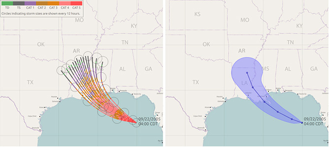
The article’s first example shows how weather forecasters predict the path of a hurricane. Drawn on a map, a “cone of uncertainty” starts at a point and extends out to show uncertainty in the path of the storm in the days ahead.
One problem with this visualization is that many people interpret the entirety of the cone as the determined area where the storm will hit. In reality, the cone is intended to indicate that the storm may take a multitude of paths, and that it is harder to predict its location further into the future. Showing a number of possible storm paths on a map, researchers argue, can make the difficult nature of predicting storms clearer, thus preventing misunderstanding.
“There are always some shades of grey in data,” Hullman said. “The problem with data visualization is that we often present data in a way that makes uncertainty easy to ignore, so that’s what people do.”
People around the world came face to face with uncertainty on the night of the 2016 presidential election in the US. For the first time, the New York Times introduced an animated needle on its website that toggled in real time between Donald Trump and Hillary Clinton’s chances of winning the election. “Seeing a constantly moving visualization made many viewers anxious,” the article reads. “Uncertainty visualizations should provoke anxiety that is proportional to the uncertainty in the data.”
Hullman explores the tradeoffs of data visualizations in her work at Northwestern Engineering and Medill School of Journalism, Media, Integrated Marketing Communications. She directs the MU Collective, a lab devoted to information visualization and uncertainty recognition. In addition to developing visualization and interaction techniques, her lab also develops models to understand how people react to data. For example, earlier this year she published the paper “A Bayesian Cognition Approach to Improve Data Visualization,” in which she and collaborators used Bayesian models to analyze how people change their beliefs based on how people interpret data visualizations.
“People don’t like uncertainty,” said Hullman. “But it’s important to teach people how to interpret data and understand the uncertainty within it.”