Atlasify: Search Using Maps
It’s been 25 years since a group of students introduced Archie, the world’s first Internet search engine. Since then, search engines have become smarter, faster, and more personalized. Their objectives, however, have remained mostly the same.
“What people use search engines for is what search engines are made for,” said Prof. Douglas Downey, associate professor of electrical engineering and computer science. “Search engines are very good at finding specific Web pages. We wanted to design a search engine that does something very different — one that helps you explore concepts.”
On June 16, Downey and his team launched a beta version of Atlasify, a new search engine that does more than respond to queries. It invites users to explore new concepts by automatically generating cartographic “atlases” about subjects of interest. The project is a collaboration with University of Minnesota assistant professor Brent Hecht, who earned his PhD from the McCormick School of Engineering.
“When we’re searching the Web trying to learn about a new concept, just finding a list of 10 links to various Web pages isn’t ideal,” Hecht said. “On the other hand, we know that thematic cartography is very effective at helping people explore unfamiliar information landscapes. Atlasify takes this long-standing benefit of cartography and applies it to general search.”
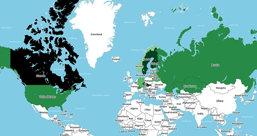
If a user searches for “ice hockey,” for example, Atlasify projects the results over a color-coded world map to automatically generate, in Hecht’s words, a “thematic atlas” relating to the query. Regions that are darker in color are more related to hockey, and regions that are lighter are less related. When a user clicks on a country, state, province, or place of interest in the interactive visualization, an explanation of the relatedness appears detailing the relationships between the clicked place and ice hockey. In this scenario, Canada and Sweden — two countries where hockey is popular — appear the darkest, while Saudi Arabia and Brazil are white and have no recorded relationship to the sport.
“The heat maps allow you to see how related your query is to different places, and then you can dig into reasons why it’s related,” Downey said. “It’s a different experience from just reading and turns up some surprising connections.”
Downey credits the “richness of Wikipedia” for helping to power the project. Developed by Hecht and Downey, an “explanatory semantic relatedness algorithm” mines the popular online encyclopedia to determine the amount of relatedness between concepts. Text that appears on the visualizations to explain the relatedness is also mined from Wikipedia.
The project is still a work in progress. Researchers are still working to find textual explanations for relationships, and they are soliciting user feedback to help evaluate and improve the system.
Although Hecht and Downey refer to Atlasify as “the geography of everything,” the search engine enables users to go beyond maps. Other visualization options include the Periodic Table of Elements, US Senate seating chart, and a historic timeline, so users can also see how topics are related to chemistry, politics, and history. Downey said users will soon be able to create their own reference systems for visualizations in Atlasify.
“The visualizations allow users to instantly see regional or global trends,” Downey said. “Seeing how concepts are related at a glance is not something you can do with existing tools. Altasify is a new way to increase your understanding of a concept, and we’re excited for people to use it.”