Tracking a Public Health Tsunami
Remember those days of casual conversations with the office staff as you stopped on your way to make an espresso? One such chat launched Tony Dalrymple, Distinguished Professor of Coastal Engineering in the Dept. of Civil & Environmental Engineering and an expert on tsunamis and other extreme coastal events, on an unexpected journey tracking the pandemic’s spread and the ensuing vaccination campaign. He writes a daily newsletter chock full of information and graphs (and a few opinions) and emails it to a long list of recipients. Today (February 25) is March 362, corresponding to his 343rd COVID newsletter, which marked March 1, 2020 as t=0. Tony paused his COVID tracking and coastal modeling to answer a few questions.
What inspired you to follow the pandemic in this way? Do you have a second career as an epidemiologist?
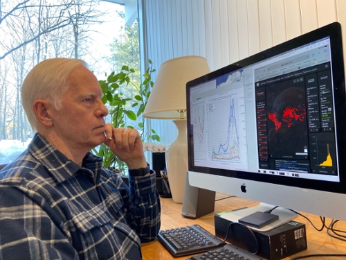
During the first week in March, US case numbers were beginning to dominate the news, and they were constantly changing. It was difficult for me to determine how much bigger one day’s number was from the day before since the data were reported without context. So I decided to make a simple plot of the number of confirmed cases of COVID-19 with the daily numbers from March 5 to March 19. That plot showed that the cases were increasing exponentially. I emailed a few people in the department to see if they were interested in the plot, which I updated daily. In that email, the plot showed the US had experienced 9,415 confirmed cases, and I made the wild prediction that more than 100,000 cases would occur by the end of the month -- more than a factor of ten times more. (The number of cases turned out to be well over 150,000.)
Epidemiology is a very interesting field. Some of it involves using numerical models to follow the spread of a disease and its waning as the number of susceptible people decline, due to either immunity or death. So the modeling is interesting to me, but it is difficult to do since peoples’ behaviors change during the course of a disease, which is why there are so many of these models available (See the COVID-19 Forecast Hub, for example.)But to answer your second question, no, I am not an epidemiologist, nor am I going to become one.
What numbers do you follow? Why?
The original two plots have grown to six. Beyond the US cumulative number of cases, I plot the world’s number of cases and those for three states: Illinois, of course, then NY, since it was doing so poorly during the first surge, and then GA, because it was governed by a man who didn’t believe in the necessity of public health measures. Then there is the tracking of deaths (US and worldwide). One plot shows an estimate of how many days it takes for six different measures to double, such as the number of confirmed cases in the US. Another plot looks at the daily numbers, such as the number of new cases in the US, the world, and the three states. This is the plot that shows the surges. Another plot shows testing data (numbers and test positivity) and hospitalization data. Finally, I developed the lagged case fatality ratio, which is the current number of deaths divided by the number of confirmed cases 14 days earlier. (I discovered later that experts had just written papers inventing this lagged measure.)
In addition to my six plots, I usually include five or six news items about the pandemic and the vaccines that I find interesting. I also include articles about making and wearing masks and other advice and often cite new CDC reports or guidance.
How many people are on your COVID newsletter?
It is a small group, just over 100 people from all over the country. I don’t know how many others read it through forwarding.
Who is your audience – any notable feedback or comments?
The group is diverse—probably 10% doctors, another 15% nurses and other medical professionals. Others, like the CEE people, who signed up on March 19, are academics. Some friends and students are on the list as well.
I get about five emails a week from readers. Some with suggestions or articles. Sometimes it is positive feedback. As an example, close to Election Day, I heard from a nurse in Maine, who had forwarded my discussion about how people with COVID could vote to her nursing group, which was seeking guidance.
What day are we now – March 361?
My plots originate on two different dates; five begin on March 1, 2020, and the sixth on April 1, 2020. Rather than try to plot the days according to the various months, everything is counted from March 1 or April 1. (I provide a list that relates the various days in March to the days in the subsequent 11 months.)
Is there one or two things you have found particularly surprising about this pandemic event?
Several measures have been helpful in revealing trends in the pandemic. The first thing I noticed in March was the variation in data reported over the course of each week because reporting is not robust during the weekends. This suggested using a 7-day moving average on almost all the data to minimize the weekend effect. For the US cumulative confirmed cases, I best-fit a straight line to the last ten days of data to project forward in time, but then I realized that the line’s slope provided a 10-day average daily number of new cases. So with these two averages, I could keep track of trends: when a surge is happening, the 7-day moving average of the daily confirmed cases is more responsive to the data, so the difference between the averages is a useful indicator of change. The day-to-day changes of the averages also point to impending surge peaks before they are obvious.
What have I learned?
A fair bit about public health measures. Quite a bit about epidemiological models, how to calculate the efficacy of vaccines based on trial results, and how to calculate specificity, sensitivity, and accuracy for a COVID-19 test. I’ve also encountered ethical questions: should we prioritize vaccines by the goal of preventing deaths or curbing the spread of the virus? The answer suggests which parts of the population should be inoculated in what order while demand exceeds supply. Also, should the US be providing vaccines to other countries if it means some Americans will have to wait for their vaccines? All these topics found their way into the emails.
What has disappointed you the most about this pandemic?
The lack of Presidential and federal leadership surrounding public health measures. Many people have died needlessly. There is no excuse for the US to have 4% of the world’s population and 25% of its cases. The politicization of the CDC has also been tragic, and the threats suffered by federal and state public health professionals are inexcusable.
What has impressed you the most?
The rapidity of vaccine development and the huge pivot in research and technology to tackle SARS-CoV-2.
When do you think life will be back to normal?
Who knows, but I would hazard a guess that the epidemiological answer is it will not occur until most people are vaccinated. Until then public health measures should continue to be followed. The real concern is that people will revert to pre-pandemic behavior too early, dragging it out. This is because the vaccines are not 100% effective, and they are becoming less effective as the virus mutates. Further, we don’t yet know if a fully vaccinated person could still be an asymptomatic carrier of the virus.
When will you stop the daily emails?
I don’t know. It is a part of my life now. Perhaps not until this is over.