Student Research | A Demonstration of "Popout"
By Dylan Fontaine, Class of 2017
This excerpt is taken from an MSiA student research blog posting. Each month, students in our program submit original extracurricular research as part of our blog competition. The winner(s) are published to the MSiA Student Research Blog, our program website, and receive a chance to attend an analytics conference of their choice. Visit our blog to see more.
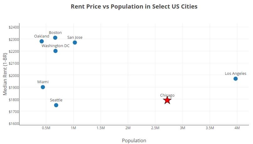
When creating a data visualization, it is often necessary to emphasize certain points so that they stand out from their surroundings. Doing so can help the author communicate their intended message to the viewer quickly and clearly. For example, I made the point for Chicago a red star on the scatterplot below to highlight Chicago’s relatively low rent prices and large population compared to other major US cities.
In my data visualization class, I learned that the emphasis placed on certain points of a graph is called “popout”. Popout is a fitting name, because emphasized points do just that… they “popout” to the viewer. A variety of visual channels can be used to make points popout from their surroundings. They can be colored more brightly, given a unique shape, increased in size, etc. Sometimes a combination of visual channels is used to make points popout.
The method that a chart designer uses to make points popout is very important. The human eye responds much more quickly to some cues than others, so a viewer may quickly see points emphasized with an effective method of popout, while taking longer to see points emphasized with a less effective method of popout. Speed is not everything when it comes to making a good data visualization, as the entire design and impression made on the viewer must also be considered, but I wanted to investigate and quantify the speed at which a viewer can react to various visual channels.